


I spent most of this week reviewing several of the new Breitling replicas for 2025, not with the intention of finding dramatic changes, but to understand why so many collectors have been describing this year’s batches as calmer, more confident, and more mature. After enough time handling different models side by side, those comments start to make sense.
The earlier generations of Breitling replicas often felt like they were trying to prove a point. The polishing was bright, the printing was bold, and the cases sometimes leaned toward sharpness rather than coherence. This year’s models take the opposite approach. They carry themselves with more restraint, and that restraint is exactly what makes them more convincing.
The cases show the clearest improvement. The brushing doesn’t shout the way it used to. Instead, it moves across the lugs with a more deliberate direction, letting the case lines speak without forcing reflections. Under softer light, the grain looks smoother, and the transitions between brushed and polished areas feel more intentional. You can sense that the factories spent time studying how the light interacts with the original pieces.
The bezels have also gained a steadier identity. Earlier replicas occasionally betrayed themselves through loose clicks or slight misalignment. The 2025 batches, by contrast, rotate with a more grounded feel. The clicks land with defined spacing, and the bezel sits more securely against the case. Even the ceramic tones appear less aggressive, giving the watches a gentler but more refined visual impact.
Dial behavior has matured considerably. Breitling dials are often complex, filled with minute scales, sub-dials, tachymeters, and markings that leave no room for error. In the past, these details sometimes felt crowded or overly sharp. The latest versions introduce better spacing and more consistent printing weight. On Navitimer and Chronomat models, the hierarchy of information feels clearer, making each layer of the dial easier to read.
The markers benefit from subtle improvements as well. On earlier replicas, the lume occasionally drifted toward the edges, creating faint shadows and inconsistent brightness. The 2025 lume sits more firmly in the center of each marker, producing a cleaner glow that doesn’t distort the edges. The polished surfaces on the markers look more even too, helping the dial feel cohesive from any angle.
Hands have also received noticeable attention. The beveling feels more controlled, the polishing less reflective, and the central pinions appear cleaner when viewed closely. These aren’t dramatic changes, but they bring a more authentic sense of depth and intention to the dial.
Bracelets remain one of the areas where factories often reveal their limitations, but this year shows promising growth. The link articulation is smoother, the brushing maintains a more unified tone from case to clasp, and the slight rattling that used to give away replicas is far less noticeable. Even the curvature of the bracelets when held loosely feels more natural, as if the links finally learned how to move together instead of separately.
The clasps feel different too. In earlier runs, the closing action sometimes felt disconnected—as if the mechanism was strong but the structure around it wasn’t. The newer clasps carry a firmer, more even tension. Opening and closing the clasp feels consistent, and the hinge no longer produces that hollow echo that used to disrupt the illusion.
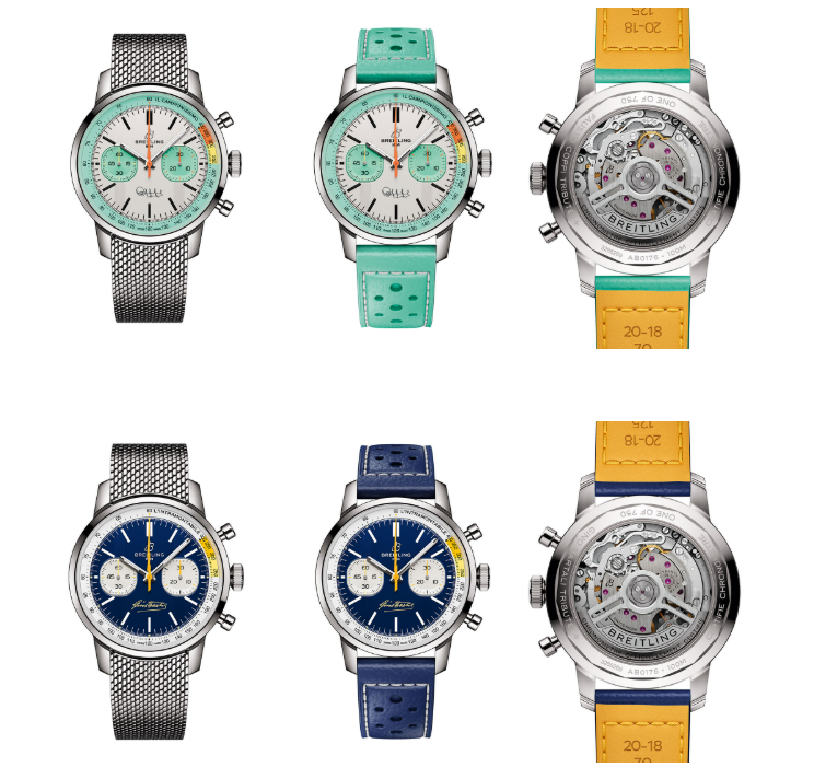
A few models stood out as particularly well-rounded during the comparison:
Navitimer 43
This model shows the most stable printing among this year’s releases. The text spacing looks cleaner, and the slide-rule ring feels more harmonized with the rest of the dial. The brushing around the bezel is softer, giving the watch a more mature personality.
Chronomat B01
The bracelet improvements are most noticeable here. The links behave with a relaxed, fluid motion, and the tonal match between case and bracelet feels more authentic. The dial printing looks steadier as well.
Avenger Series
The bezel action is markedly better. The clicks feel more deliberate, and the ceramic tones appear calmer under mixed lighting. The lume across the dial and hands behaves with pleasing consistency.
Superocean Heritage
The bezel colors look more disciplined. The blues and greens hold their depth without drifting toward excessive brightness. The markers feel more precisely applied, giving the entire design a more refined presence.
Premier Chronograph
The polishing has become more controlled and less glossy, making the surfaces feel smoother and more balanced. The dial feels cleaner, with more predictable reflections and calmer indices.
All these improvements share the same underlying character: confidence without arrogance. The factories didn’t try to reinvent the watches. Instead, they stepped back and refined the elements that matter most—brushing, dial spacing, ceramic tones, lume consistency, bracelet articulation, and the overall harmony of the case.
Anyone looking for a more organized comparison across the strongest 2025 Breitling replicas will find this reference helpful: breitling replica The 2025 season doesn’t overwhelm you with change. It quietly builds trust through refinement, and that is exactly why these new Breitling replicas feel more complete than the versions that came before them. They’re not louder—they’re steadier. And steady watches tend to stay with you longer.